I've been a visual learner my whole life.
As a student, my hand-scribed notes were always accompanied by graphic organizers, and my index card flashcards were accompanied by some type of hand-drawn visual cue. (For example, in order to remember what word "libertatis" meant for a Latin exam, I sketched a picture of the Statue of Liberty next to the word...because "libertatis" means "freedom.")
All that sketching and visualizing? It turns out I was ahead of my time.
Presently, infographics have taken center stage, as you may have noticed. It's because the less-words-and-more-images approach has been scientifically proven to increase information retention. According to Mary Jo Madda in her article entitled "Why Your Students Forgot Everything on Your PowerPoint Slides," our kiddos are in cognitive overload with our bullet-laden PowerPoint slides and the redundancy effect of us reading aloud from them.
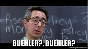 | (Not that any of my dear readers even remotely resemble the economics teacher from "Ferris Bueller's Day Off," I'm certain. I'm just trying to make a point.) |
Image courtesy of MemeGenerator
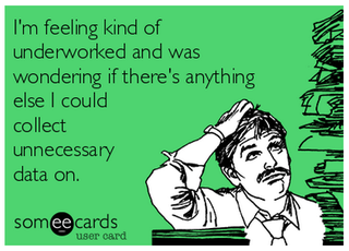
Imagine trying to pour water into an already-full glass. Now you have a clear image of what cognitive overload is all about.
| In order to avoid cognitive overload, Richard Mayer, a brain scientist and author of the book Multimedia Learning, offers the following solution: Eliminate textual elements from presentations and instead talk through points, sharing images or graphs with students. (You can watch a quick video of his theory here. More visual learning--yay!) |  image courtesy of Vimeo |
Data visualization is totally legit. Just ask David McCandless, who takes mind-numbing data and transforms it into beautiful and simple graphics because, as he so accurately puts it, good design is the best way to navigate information glut. His TED talk on the subject absolutely and firmly convinced me to drink the infographic Kool-Aid. For those of you who think that infographics dumb-down our kids or spoon-feed them information, watch this 17-minute talk. As McCandless demonstrates, identifying and evaluating the hidden patterns in data visualization is higher-level thinking at its best.
Still not convinced? Then you really need to check out this infographic about why infographics are so essential. (An infographic about infographics? How totally meta!)
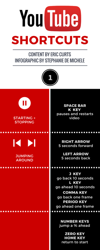
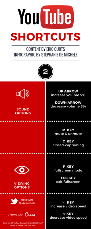
In any event, I'm practicing what I preach. The other day, this very helpful post from Eric Curts' blog Control Alt Achieve came my way: "26 YouTube Shortcuts Everyone Should Know." I wanted to share it with the teachers in my district, but I knew if I forwarded it, it would get stuck in the vast virtual wasteland of inboxes, or worse yet, it would get printed and forever lost in the shuffle of the perpetual paper piles. I wanted to condense it, because while it was incredible relevant and useful--it was just still too wordy for me.
That's when I busted out my favorite graphic design tool, Canva, and its spawn, Canva Infographic Maker. Like it promises, Canva does indeed make design simple for everyone. If you're new to Canva, I HIGHLY recommend pouring yourself a glass of wine and giving over an hour of your life to Canva Design School's tutorials. Seriously. Otherwise, you'll just be re-creating your crappy PowerPoints in a new platform.
Okay, enough talk. How about a little show? Here's what I made in under an hour, using Eric's content:
Still not convinced? Then you really need to check out this infographic about why infographics are so essential. (An infographic about infographics? How totally meta!)
In any event, I'm practicing what I preach. The other day, this very helpful post from Eric Curts' blog Control Alt Achieve came my way: "26 YouTube Shortcuts Everyone Should Know." I wanted to share it with the teachers in my district, but I knew if I forwarded it, it would get stuck in the vast virtual wasteland of inboxes, or worse yet, it would get printed and forever lost in the shuffle of the perpetual paper piles. I wanted to condense it, because while it was incredible relevant and useful--it was just still too wordy for me.
That's when I busted out my favorite graphic design tool, Canva, and its spawn, Canva Infographic Maker. Like it promises, Canva does indeed make design simple for everyone. If you're new to Canva, I HIGHLY recommend pouring yourself a glass of wine and giving over an hour of your life to Canva Design School's tutorials. Seriously. Otherwise, you'll just be re-creating your crappy PowerPoints in a new platform.
Okay, enough talk. How about a little show? Here's what I made in under an hour, using Eric's content:
 |  |
While I know I'm not going to light the graphic design industry on fire, I'm still pretty proud of myself.
So what do you think? Ready to give it a try yourself? How about transforming one of your current PowerPoint presentations and comparing the before and after versions? You'll be amazed at what you can create. And your students will be grateful that you've saved their brains from overload.
So what do you think? Ready to give it a try yourself? How about transforming one of your current PowerPoint presentations and comparing the before and after versions? You'll be amazed at what you can create. And your students will be grateful that you've saved their brains from overload.